

KPL Home Logo Design
Logo Design Project for KPL Home
Client Overview
Client: KPL Home
Industry: Real Estate
KPL Home is a real estate business seeking to establish a strong brand identity with a modern and memorable logo that reflects their goals and values.
Project Overview
Goals and Objectives:
The primary goal was to create a modern, simple, and memorable logo that would help KPL Home establish a solid brand identity in the competitive real estate market. The logo needed to clearly communicate the business’s focus and resonate with their target audience.
Design Brief
The client requested a logo that was modern, simple, and memorable. It was important for the logo to incorporate elements that represent real estate, such as houses, to immediately convey the nature of their business.
Research and Inspiration
To ensure the logo would stand out while fitting within industry norms, we conducted market research and analyzed logos from similar businesses. This research helped identify common elements and design trends in the real estate sector, providing a foundation for our creative process.
Key Elements:
- Incorporation of house icons to clearly represent the real estate industry.
- Use of modern and clean design elements to ensure simplicity and memorability.
Concept Development
We developed three initial logo concepts, each incorporating the key elements and reflecting the desired brand identity. These concepts were designed to provide distinct options while maintaining a consistent theme related to real estate.
Concept Presentation:
After presenting the three initial concepts to the client, one concept stood out and was selected without any need for modifications. The chosen design effectively captured the client’s vision and met their expectations.
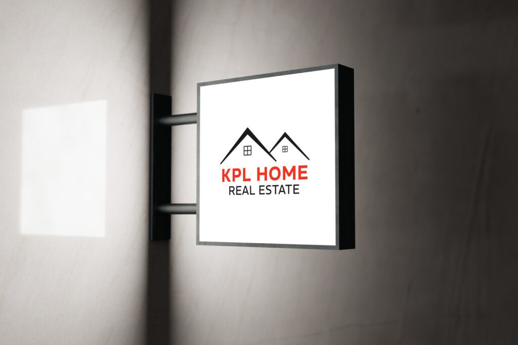
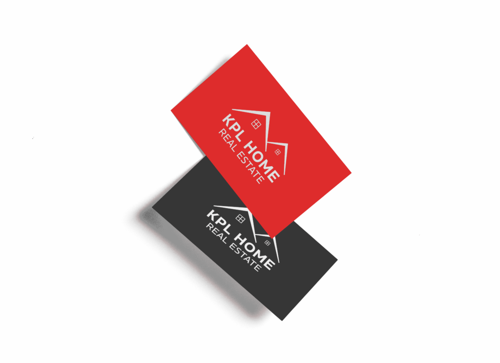
Final Design
The final logo features two stylized house icons, symbolizing the core of the real estate business. The clean lines and modern aesthetic align with the client’s goal of creating a memorable and professional brand identity. The color scheme, primarily black and red, was chosen to convey confidence and reliability.
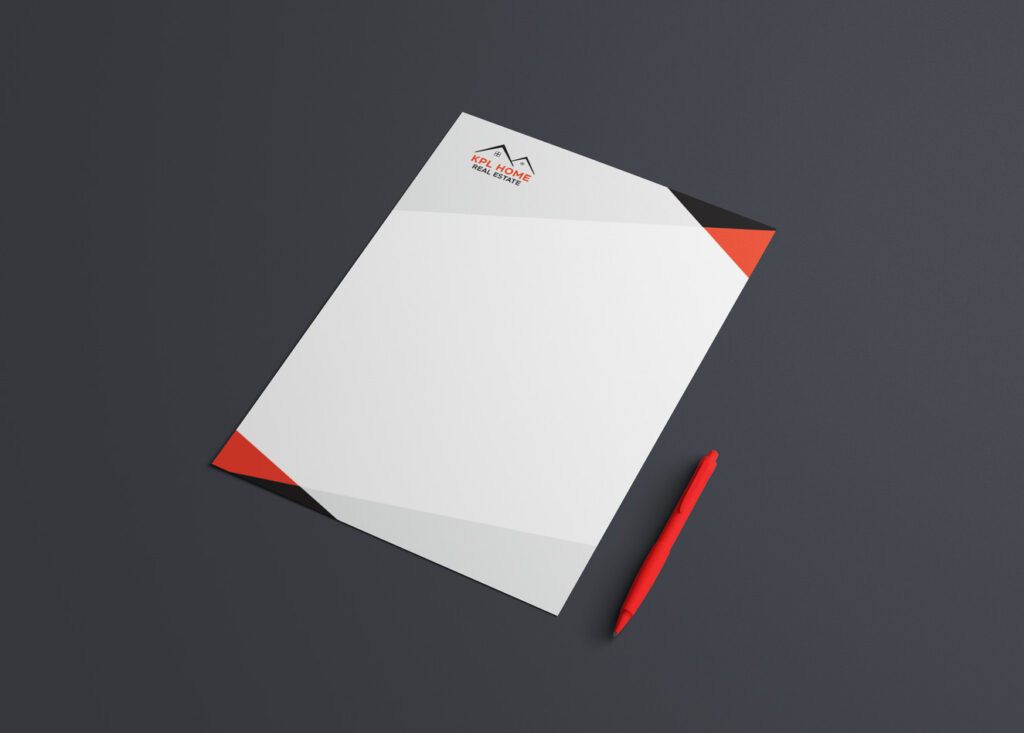
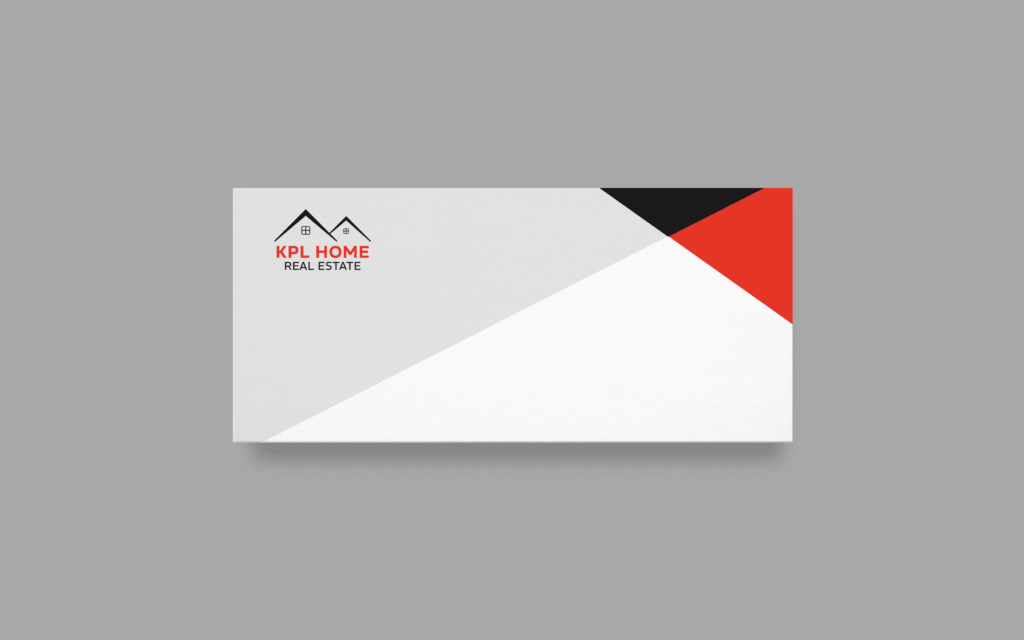
Applications and Versatility
To ensure the logo’s versatility across different mediums, we provided the client with various file types and sizes. Additionally, a usage guide was created to help KPL Home apply the logo consistently across all their branding materials.
Additional Designs:
- Envelope design
- Letterhead design
Collaboration and Feedback
Throughout the design process, we maintained close communication with the client. Initially, we discussed their ideas and expectations, which guided our concept development. The client’s positive feedback and swift selection of the final design indicated strong alignment with their vision.
Impact and Outcomes
The new logo has helped KPL Home establish a distinct brand identity in the real estate market. The modern and memorable design effectively communicates their business focus and has been well received by their audience.
Client Feedback:
The client expressed complete satisfaction with the logo, noting that it perfectly captured their vision and exceeded their expectations. They appreciated the professional and efficient design process.
Visualizn Design Studio is proud to have partnered with KPL Home to create a logo that effectively represents their brand and supports their business goals. For more information on our design services and how we can help elevate your brand, contact us at info@visualizn.com or through our contact page.